
The much used and venerable CCleaner’s interface has remained virtually unchanged for years but, with the release of its latest CCleaner version (v5 Beta), Piriform has decided it’s time for a new look.
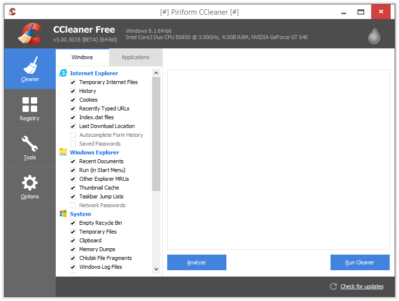
As you can see from the above screenshot, the new ‘flat’ design pretty much emulates the look of the latest Windows operating systems. Changes to a software’s interface design can often be controversial, whether a new look is for the better or not being entirely subjective. Personally, it doesn’t bother me as long as the software continues to perform as expected.
*Note: this particular version is still in Beta mode and as such unsuitable for general use:
For advanced users we have a beta version of CCleaner v5 available for you to download. (We don’t recommend using this outside of test environments).
- Download CCleaner 5.0 Beta here: http://www.piriform.com/blog/2014/11/14/ccleaner-v50-is-now-available-in-beta
This version WILL install over the top of previous versions so be careful – as far as I can see, there is no portable version available as yet.
Although this particular release includes interface changes only, Piriform has indicated that more features will be added over the coming week with a final release scheduled for the end of November:
This build includes just the interface change. The other features will be coming over the next week, with a final release build at the end of the month.
The company has not yet revealed details of what “other features” we can expect.
So what do you think, do you like the new look or hate it? Let us know through the comments.
The new look is fine, I’m more interested on the new features they are talking about.
I hope you’ll make a new comparison with PrivaZear once the new CCleaner is released 🙂
Why would anyone want to change or fix Ccleaner when it’s not broken ??? A new interface??? …. I don’t like it at all, this “new look” is FLAT like a pancake and ugly. The new “face” looks more like an intent to make Ccleaner look like Wins 8 with the large icons. Please take it away… it’s just to FLAT with no color. I would applaud new features and options but this “face lift” is a no no … Ccleaner has just about “everything” you can think of which makes it the industry standard when we speak of cleaners and most consider it to be The Best. I myself have it on a pedestal and it’s the best and easy to use “no issue cleaner” as well. Never had a problem at all. I wonder what new features and options they are going to include if any. I would have preferred new features but THIS UGLY FACE is not a update. This just might be the first time that Piriform has failed with a not desired “face lift” …. No no and no. Keep it just as it is, PLEASE….
Looking forward to your Newsletter. Thank you, I am “1ten2”
Worst GUI ever! This colors and the flat buttons are for 3 years old kids tapping everything the can.
@PiriForm: Please let us choose the GUI in a very next version. THIS one is really shi..y!
UGLY UGLY UGLY Worst GUI ever! This colors and the flat buttons are for 3 years old kids tapping everything the can.
@PiriForm: Please let us choose the GUI in a very next version. THIS one is really UGLY!
For me, it’s less the flatness, but more the abundance of white (it hurts my eyes). But I definitively agree with Michael; we should be able to choose the look we want.
Hate the new look
Hate this new design. Piriform should hire me as an adviser. Personally thought the Piriform people was smart. In other words, thought this new ugly design only concerned the FREE-version. Thought they made the free version this ugly, so people would want to pay to upgrade to the payable PRO-version and get the traditional nice design…